Gooru
I had the opportunity, perseverance and good fortune to work on a project for 5 years. Here’s what I’ve learnt as I help design an education platform for multiple users, scenarios, and geographies.
Gooru and I started collaborating in early 2016, to work on reimagining the digital education landscape for their platform. Here’s an overview of what I’ve learnt as I help UX and interfaces for multiple users, scenarios, and geographies.

A Conceptual Test
We tested the waters out with an abstract exercise. I was presented the concept of a ‘map’ of knowledge, and tasked with pitching a visual representation of it - one that could be interacted with, and displayed several layers of information. After a couple of consultations with the staff, this is what I came up with.
When I joined Gooru, I was still playing around the corners of interface design and as such, was comfortable building smaller prototypes, with little real experience designing a product to scale. Our plan was to do spot-fixes to the then-current product, while developing an all-new framework (and my fledgling UX design ability) in parallel.
Zooming straight In
We began work by spot-fixing the user experience on their active product, while concurrently developing a new, enriched framework from the ground-up. We spent about a year methodically responding to user complaints and suggestions, all while brainstorming pathways on the weekends.
Practical design experience aside, I think my biggest learning from this period was from the focus & intellectual flexing brought to bear by my colleagues. Leading by example, they improved my ability to think coherently & my ability to focus, and still gave me the freedom to deploy my growing skills as I saw fit.
At the end of year 1, I had gained enough exposure to the product to have a grasp of its different components, its scale, and how everything fit together.
Abstracting Outward
Once we had established a working base line, we decided that we would spend the net two yeras defining and developing a ‘Vision’ prototype for the student experience, the teacher experience on laptop and mobile platforms, and a desktop-only district administrator experience.
Vision Prototype
To begin with, we focused primarily on the student side of the application, seeing as it was the most important tool in selling the product to universities and investors. It was absolutely vital that the student application covered a large amount of workflows, in order for it to be viable for students from the USA to Egypt to India, and beyond. We conducted several research and testing sessions with stakeholders ranging from grassroots educators in India to post-doctoral professors at MIT, to school principles and grade school teachers across several districts in the USA.
Alongside the vision prototype, we took the current student app, and worked on developing it in the general direction of the vision we had defined.
With our student platform setting a benchmark for product standards and principles, we set about examining the teachers’ role in the educative process, using their interactive touch-points as a basis for designing their platform. We first defined a standard “textbook curriculum” course structure, and then augmented it with a section called Daily Class Activities. This structure enabled teachers a sandbox environment that could be used to conduct spot-checks on students’ skills and progress, without affecting their curriculum scores. It was also

Deploying a design system
As development began working on the newly designed platform, we started seeing several visual differences, and it took a significant amount of hand-holding to solve the initial problems. Eventually it occured to me that the problem lay not with them, but with me. I needed to provide developers a ‘cheat-sheet’ of components that would be built once, and inserted wherever needed. This became even more important as we started to implement across different form factors. /// incomplete ///
I’m rather proud today to show off how very miniscule the development style guide has become, despite needing to satisfy several form factors, platforms, and functions. Over 700 screens have been developed and implemented, and they all require only the components here.
Designing for the future
Spurred on by the success of the design system, I took on the task for downsizing the components. It ended up with a whole new chapter of the design guide, with the design really looking polished and refined. By this time, development had also understood the mechanics behind the style guide, and their output was becoming more systematic. This significantly reduced time lost to redoing screens, discussions to explain guiding principles of spacing, colour and icon sizes, and instead opened the time up to discuss how we could further streamline our product and its development.
Cross-cultural collaboration
Part of the allure of this work is the constant opportunity to interact with motivated, intelligent people across geographies and demographies.
I have had the good fortune to work with multiple specialists in technology, administration, marketing, networking, art, design, government and grassroots organisations… and I learn something new every single day!


Personally Satisfying
In addition to the work itself, Gooru has played an important part in my personal development, too. They enabled me to travel the world physically, and in doing so opened opportunities for me to experience the world in ways previously unaccessible to me. I saw Californian Redwoods, drove Chris Bangle’s beautiful BMW Z4 down the pacific coast, cycled all of San Francisco, afford real Japanese food, travel the west coast on Amtrak’s terrific Coast Starlight, and work in an office space that I truly appreciated.
Gooru helped me discover several satisfying new ways to spend my time outside of work, and this is the kind of learning that I cannot put a price on.
5-Year Snapshots
In the span of 5 years, the clients’ UI requirement has grown considerably. When work began in 2016, the product was a browser-only, student-oriented offering. In the span of 5 years, we have expanded it to cover students, teachers, multi-tier administrators, guardians, investors & researchers. Additionally, the platforms have been developed to work on work-stations, laptops, chromebooks, tablets & mobile platforms.
I figured that after 5 years, it would be nice to make a little tribute to the colossal effort the team has put in, because almost everything was rebuilt from scratch. Underneath are snapshots of a handful of the platforms I’m constantly iterating on.
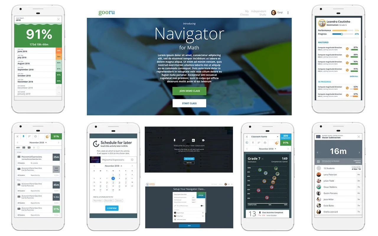
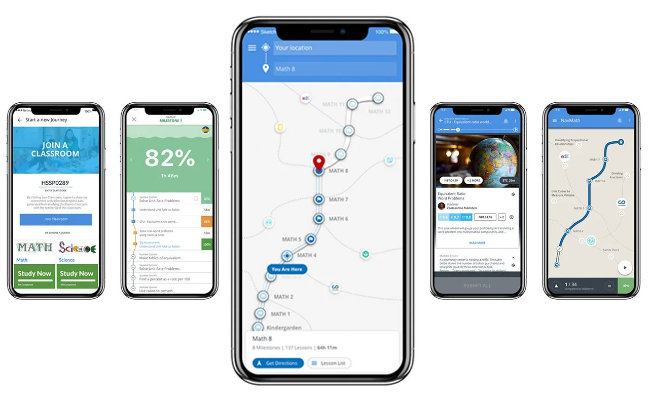
Student Platform Evolution
Teacher Platform Evolution
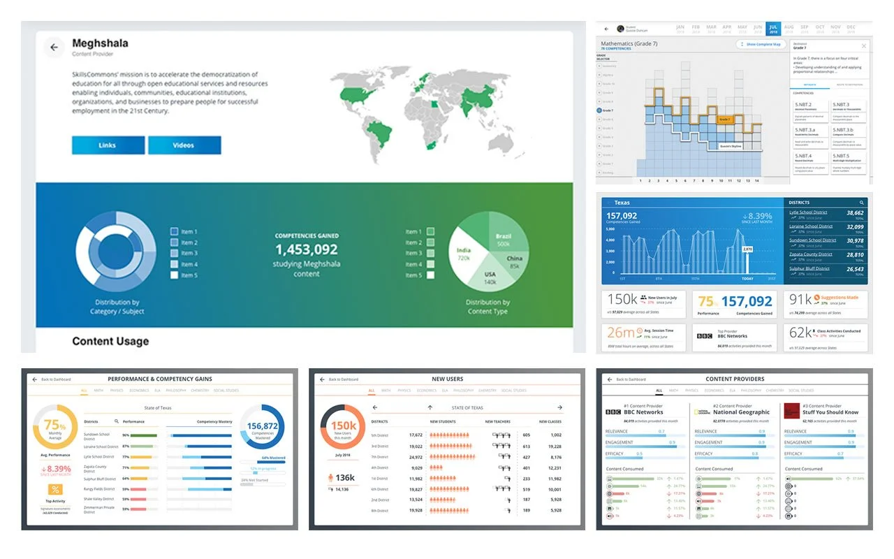
Administrator Platform Evolution
3,317
Hours Spent
9,367
Screens Designed
14
Skills Practised
702
Tickets Resolved
107
Prototypes Compiled
911
Tears Shed
63,731km
Distance Travelled
27±5
Presentations Polished
10+
Products Developed