This is the story of how we turned around a complex product overhaul and expansion, on a tight deadline.

JustBilling is a PoS (Point of Sales) software that sported an outdated, clunky interface which was clearly showing its age in the 21st century and needed an overhaul. It needed a consistent experience across 3 ecosystems - Android, iOS, and Windows - and mobile, tablet and desktop form factors. In a final twist of pressure, the entire process had to be completed in less than 90 days.
Evaluation
On the clients’ own recommendation, we started with them walking me through their product - and its problems - over a video call. In addition to the list of direct problems, the client also had a list of areas that they believed could be improved upon, though they weren’t entirely sure what approach to take with it.
It was clear that visually, the product needed a complete refresh. The tablet interface was essentially just a mobile interface with a larger screen. The Windows platform was an entirely different design altogether. A further complication was that the mobile and desktop versions of the product had significant differences in their flows, which made it confusing when a user switched from one platform to the other. Over the course of 2 weeks, we compiled the list of semantic, functional and visual flaws that needed to be addressed across both Windows and Android.
Planning

The client came to the table with a plan, which helped reduce the amount of convincing that I would otherwise have had to do. Our reasoning went along parallel, if not similar lines; they suggested that we work on Android first, then iOS, then Windows. I agreed because, to me, it made sense to design for the smallest form factor first, and then take those same elements and lay them out more effectively once the additional screen space was made available. Win-win!
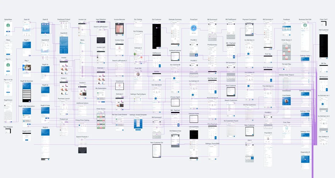
We catalogued the total unique flows within the application, then singled out the primary and auxiliary transactional flows, administrative flows, and the remaining miscellaneous screens and interactions; this would be the order in which we would tackle the product on each platform.
Defining a Design System
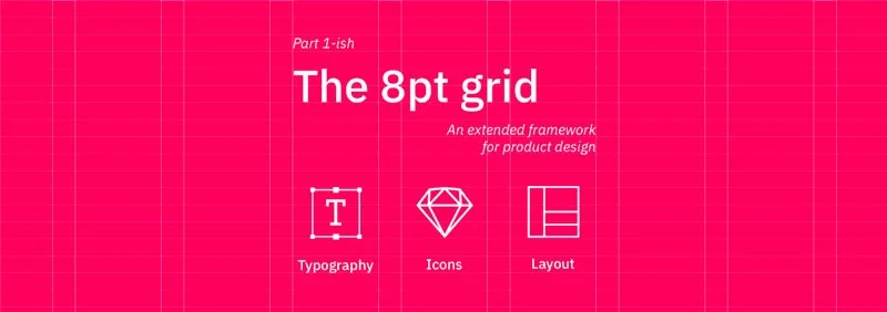
The first thing I did was to set-up a developer friendly environment; I used Google’s excellent Material Design System as the basis for our decision-making, so that even in my absence, developers had the opportunity to make informed decisions by means of referral and extrapolation. I insisted on using the 8pt grid to eliminate visual dissonance that often is the bane of designers everywhere; at the core of this system is the notion that all dimensions are multiples of 8. This includes heights, widths, separations, icon sizes, textbox dimensions, and everything else that comprises the design. In my experience, it significantly increases the chance of development output being pixel-perfect, as there is little scope for ambiguity when creating and aligning components, reduces misunderstandings and details becoming “lost in translation”.
Seeing as the team was not familiar with this system yet, I decided to further reduce their learning curve, by standardising the icon-set and using Material Design’s catalogue of svg icons. This ensured fewer bottlenecks, because development would have access to a rich support community should they have questions regarding usage, database design, code, etc. It also meant that design, development, and management had a ready-reference for any internal discussions, further reducing time (and focus!) lost in ambiguity.

We settled on a minimal colour palette with white as the majority fill, adding two shades of grey, a pastel red for negatives, and dipped into the 2 shades of blue in the logo. Our goal here was to have a colour system that was as unobtrusive as possible, whilst providing the essentials to build a detailed, repeatable, product with recognisable design cues. Since the product involved significant amounts of bite-sized data spread over multiple page-scrolls, we decided it would be best to have a ‘blank canvas’ structure populated with data, and only use colour to highlight key information and actions. The additional benefit this had was to improve the clarity of our iterative process, because we understood that each page must have a primary action/goal, (highlighted in blue), an optional negative action (in pastel red) and that everything else on the page would be supporting information, or a secondary action/choice that would navigate users to a different page, all coloured in a uniform shade of grey. Our primary task, then, was to order the information as intelligently as we could in order to support the user to make their decision on each page. We kept the scope for component design open-ended, but did make a single rule to govern the functioning of the application. We decided that the primary flows in the application would have a fixed, floating footer upon which the guiding actions were to be located. In non-primary flows, this footer would be omitted; a subtle cue to let the user know they were accessing something non-essential, and had the freedom - and additional screen space! - to explore the application at their behest.
The Build-Test-Iterate Cycle
With the design system in place, we took on the most full-featured of the primary flows - Invoicing. Since it contained the most number of unique components, we figured it was our best chance at streamlining the new brand identity from the get-go. The original product was extremely full-featured, but poorly organised in terms of feature access. PROGRESSIVE DISCLOSURE

With each flow being created, the client was getting better at guessing the motivations behind the design decisions - a clear symptom of an easy-to-understand design system! We spent less time discussing the “why” and more time pondering the “how-might-we” problem statements, often coming up solutions that combined the client’s business acumen with my minimalist, legible design system. By the time the primary flows were completed, we had an excellent grip on the new brand identity; we both understood where colour was - and was not! - to be used, the visual fundamentals of designing new components, and recognizing when a page was getting overloaded with information and needed supporting flows. This made developing the other parts of the product a much simpler task and, I was delighted when the client started correctly guessing what I was going to suggest, before I had said a word. A truly satisfying situation :)
3 Form Factors | 3 Ecosystems | 3 Months
386
Pages Created
147
Interactions Improved
290
Hours Spent
32
Clarifications Needed
38
Iterations Reviewed
68
Sessions Conducted
1
Point-of-contact
0
Physical Meetings